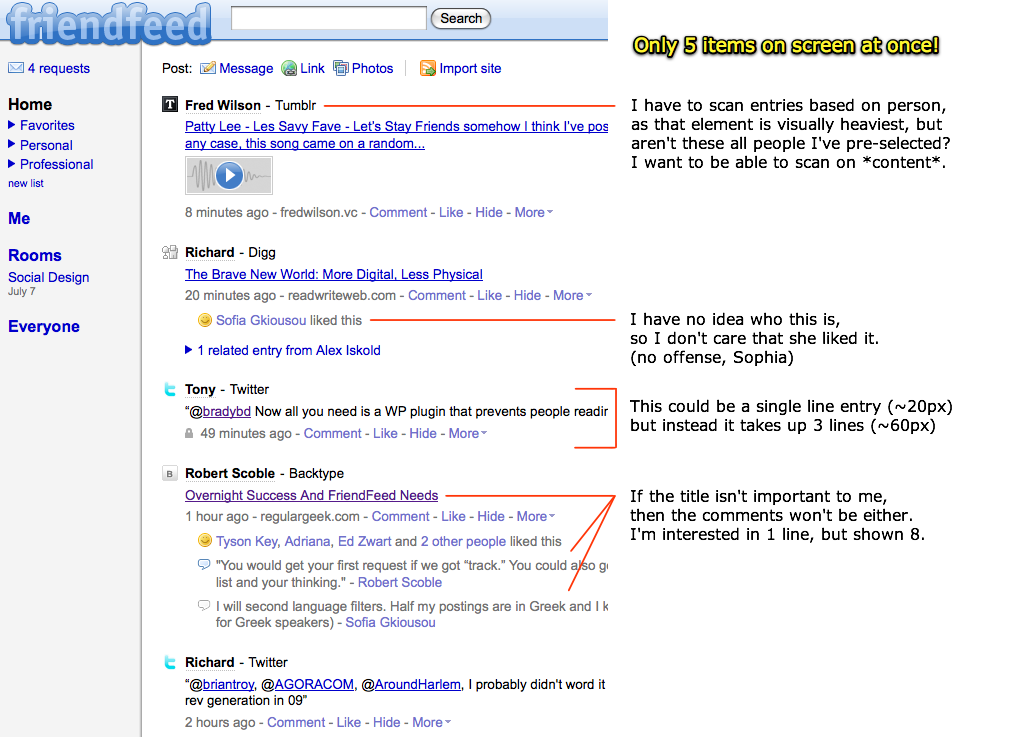
A few weeks ago, Joshua Porter posted an excellent analysis of FriendFeed's user interface in his post Thoughts on the Friendfeed interface where he provides this excellent annotated screenshot

In addition to the screenshot, Joshua levels four key criticisms about FriendFeed's current design
- Too few items per screen
- Secondary information clogs up each item
- Difficult to scan content titles quickly
- People who aren't my friends
The last item is my biggest pet peeve about FriendFeed and why I haven't found myself able to get into the service. FriendFeed goes out of its way to show me content from and links to people I don't know and haven't become friends with on the site. In the screenshot above, there are at least twice as many people Joshua isn't friends with showing up on the page than people he knows. Here are the three situations FriendFeed commonly shows non-friends in and why they are bad
- FriendFeed shows you content from friends of friends: This is major social faux pas. It may sound like a cool viral feature but showing me content from people I haven't subscribed to means I don't have control of who shows up in my feed and it takes away from the intimacy of the site because I'm always seeing content from strangers.
- FriendFeed shows you who "liked" some content: Why should I care if some total stranger liked some blog post from a friend of mine? Again, this seems like a viral feature aimed at generating page views from users clicking on the people who liked an item in the feed but it comes at the cost of visual clutter and a reduction in the intimacy of the servers by putting strangers in your face.
- FriendFeed shows comments expanded by default in the feed: In the screenshot above, the comment thread for "Overnight Success and FriendFeed Needs" takes up space that could have been used to show another item from one of Joshua's friends. The question to ask is whether a bunch of comments from people Joshua may or may not know is more valuable to show than an update from one of his friends?
In fact the majority of Joshua's remaining complaints including secondary information causing visual clutter and too few items per screen are a consequence of FriendFeed's decision to take multiple opportunities to push people you don't know in your face on the home page. The need to grow virally by encouraging connections between users is costing them by hampering their core user experience.
On the flip side, look at how Facebook has tried to address the issue of prompting users to grow their social graph without spamming the news feed with people you don't know

People often claim that activity streams make them feel like they are drowning in a river of noise. FriendFeed compounds this by drowning you in a content from people you don't even know and never even asked to get content from in the first place.
Rule #1 of every activity stream experience is that users should feel in control of what content they get in their feed. Otherwise, the tendency to succumb to the feeling of "drowning" will be overwhelming.
 Now Playing: Lupe Fiasco - Kick, Push